Senior Frontend Interview Guide, Part 5: HTML, CSS, SCSS, and Responsive Design
Strong HTML and CSS skills are what make a frontend engineer's work look and behave correctly on every device, for every user. They are also where interviews expose the gap between people who copy layouts from component libraries and people who understand the platform. This chapter covers semantic…
 Rupak NepaliPublished Nov 9, 2026
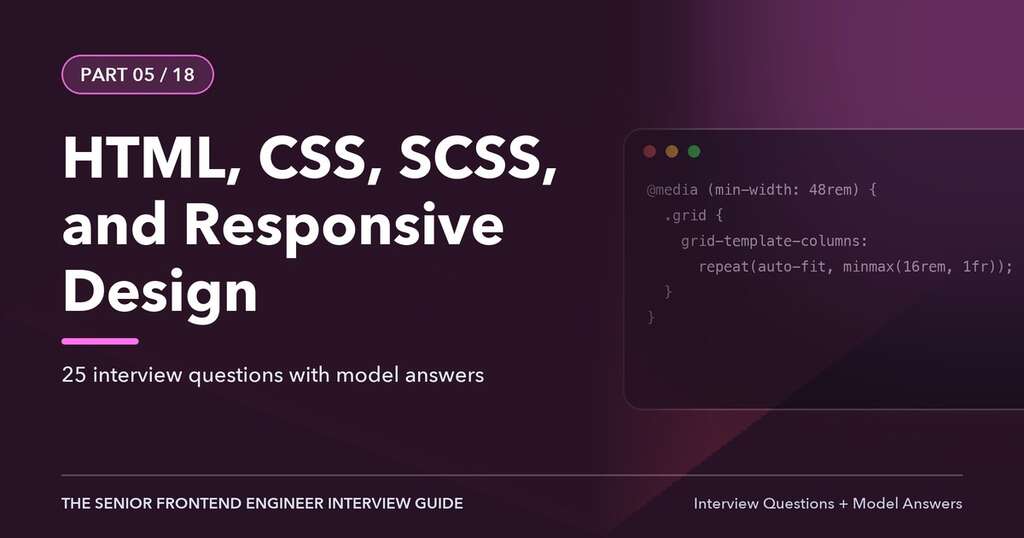
This article is Part 5 of 18 in The Senior Frontend Engineer Interview Guide, and includes 25 interview questions with model answers.
Strong HTML and CSS skills are what make a frontend engineer’s work look and behave correctly on every device, for every user. They are also where interviews expose the gap between people who copy layouts from component libraries and people who understand the platform. This chapter covers semantic HTML, the cascade and specificity, layout with Flexbox and Grid, SCSS, responsive design, modern CSS features, and rendering performance. CSS Modules and component architecture follow in Chapter 6.
Semantic HTML
Semantic HTML means choosing elements for their meaning, not their default appearance. It improves accessibility (screen readers expose structure), SEO, maintainability, and often gives you behavior for free (keyboard support on buttons, form submission, focus management).
| Use this | Instead of | Why |
|---|---|---|
<button> |
<div onClick> |
Focusable, keyboard-activatable, announced as a button, submits forms |
<a href> |
<span onClick> for navigation |
Opens in new tab, works without JS, announced as a link |
<nav>, <main>, <header>, <footer>, <aside> |
<div class="nav"> |
Landmarks for assistive technology navigation |
<h1> to <h6> in order |
Styled <div>s |
Document outline; screen reader users navigate by headings |
<ul>/<ol> |
Line breaks | Announced as list with item count |
<table> with <th scope> |
Grid of divs for tabular data |
Row/column relationships are announced |
<label for> |
Placeholder as label | Clickable label, accessible name, persists when typing |
<fieldset>/<legend> |
Visual grouping only | Groups related controls like radio buttons |
<dialog> |
Custom modal div |
Built-in focus handling, Esc to close, top layer |
A simple rule: links go somewhere, buttons do something.
Document Structure
<!doctype html>
<html lang="en">
<head>
  <meta charset="utf-8">
  <meta name="viewport" content="width=device-width, initial-scale=1">
  <title>Transfers - Online Banking</title>
  <link rel="preload" href="/fonts/inter-var.woff2" as="font" type="font/woff2" crossorigin>
</head>
<body>
  <a class="skip-link" href="#main">Skip to main content</a>
  <header>...</header>
  <nav aria-label="Primary">...</nav>
  <main id="main">
    <h1>Make a transfer</h1>
    ...
  </main>
  <footer>...</footer>
</body>
</html>
The lang attribute lets screen readers choose the right pronunciation and lets browsers apply language-specific hyphenation and quotes. The viewport meta tag is essential for responsive design: without it, mobile browsers render at a desktop width and zoom out.
Forms
Forms are central to financial applications, and they are where semantic HTML pays off most.
<form novalidate>
  <fieldset>
    <legend>Transfer details</legend>
    <label for="amount">Amount (USD)</label>
    <input id="amount" name="amount" inputmode="decimal" autocomplete="off"
           aria-describedby="amount-hint amount-error" required>
    <p id="amount-hint">Up to $10,000 per day.</p>
    <p id="amount-error" class="error" hidden></p>
  </fieldset>
  <button type="submit">Review transfer</button>
</form>
Choose input types and attributes carefully: type="email", type="tel", inputmode="numeric" (for numeric keyboards without the quirks of type="number"), and autocomplete tokens (one-time-code for MFA codes, current-password, new-password, cc-number). type="number" is a poor choice for money and account numbers because it accepts e, strips leading zeros, and changes value on scroll.
The Cascade, Specificity, and Inheritance
When multiple rules set the same property on an element, the cascade decides which wins, in this order:
- Origin and importance: user-agent styles, user styles, author styles;
!importantdeclarations reverse the order. - Cascade layers (
@layer): later layers beat earlier ones; unlayered styles beat all layers. - Specificity.
- Order of appearance: later declarations win.
Specificity is computed as a tuple (A, B, C):
- A: ID selectors.
- B: class selectors, attribute selectors, pseudo-classes.
- C: type selectors and pseudo-elements.
Inline styles beat all selectors. :where() contributes zero specificity; :is(), :not(), and :has() take the specificity of their most specific argument.
| Selector | Specificity |
|---|---|
p |
(0,0,1) |
.card p |
(0,1,1) |
#main .card p |
(1,1,1) |
button:hover |
(0,1,1) |
:where(.card) p |
(0,0,1) |
Keep specificity low and flat (single classes, as CSS Modules and BEM encourage) so that overrides are predictable without !important.
Inheritance: some properties (mostly text-related: color, font-*, line-height, visibility) inherit from parent to child by default; others (box-model, background, border) do not. The keywords inherit, initial, unset, and revert control this explicitly.
Cascade Layers
@layer reset, tokens, components, utilities;

@layer reset {
  *, *::before, *::after { box-sizing: border-box; }
}
@layer components {
  .button { padding: 0.5rem 1rem; }
}
@layer utilities {
  .mt-0 { margin-top: 0; }   /* always beats components, regardless of specificity */
}
Layers make it possible to integrate third-party CSS and a design system without specificity wars.
The Box Model
Every element is a box with content, padding, border, and margin. box-sizing: content-box (the default) makes width apply to the content only; border-box includes padding and border, which is what most people expect and why most resets set it globally.
Margin collapsing: adjacent vertical margins of block elements collapse into the larger one. It does not happen in Flexbox or Grid containers, with padding or borders between, or for elements that establish a new block formatting context (for example display: flow-root, overflow other than visible).
Display types: block, inline, inline-block, flex, grid, none, contents (the box disappears; children are laid out as if they were the parent’s children, but be careful with accessibility in older browsers).
Positioning and Stacking
position |
Behavior |
|---|---|
static |
Normal flow (default) |
relative |
Normal flow, offset visually; becomes containing block for absolute children |
absolute |
Removed from flow; positioned relative to nearest positioned ancestor |
fixed |
Relative to the viewport (unless an ancestor has a transform, filter, or perspective) |
sticky |
Relative until a scroll threshold, then sticks within its container |
Stacking contexts explain most z-index bugs. A new stacking context is created by, among others: positioned elements with a z-index other than auto, opacity less than 1, transform, filter, isolation: isolate, and flex/grid children with z-index. An element’s z-index only competes within its stacking context, so a modal with z-index: 9999 inside a parent with transform can still appear beneath a sibling of that parent. Portals (Chapter 2) and the <dialog> top layer avoid this.
Flexbox
Flexbox lays out items along one axis.
.toolbar {
  display: flex;
  align-items: center;          /* cross axis */
  justify-content: space-between; /* main axis */
  gap: 0.75rem;
  flex-wrap: wrap;
}
.toolbar__search { flex: 1 1 16rem; } /* grow, shrink, basis */
Key properties:
- Container:
flex-direction,flex-wrap,justify-content,align-items,align-content,gap. - Items:
flex-grow,flex-shrink,flex-basis(shorthandflex),align-self,order. flex: 1means1 1 0%: items share space equally regardless of content.flex: automeans1 1 auto: space is shared after content size.- Flex items have
min-width: autoby default, so long content (like an unbroken account number) can overflow. Settingmin-width: 0on the item lets it shrink and allowstext-overflow: ellipsisto work.
Avoid order for meaningful reordering: it changes visual order but not DOM or focus order, which confuses keyboard and screen reader users.
CSS Grid
Grid lays out items in two dimensions.
.dashboard {
  display: grid;
  grid-template-columns: repeat(auto-fit, minmax(18rem, 1fr));
  gap: 1rem;
}

.app-shell {
  display: grid;
  grid-template-areas:
    "header header"
    "nav    main"
    "footer footer";
  grid-template-columns: 16rem 1fr;
  grid-template-rows: auto 1fr auto;
  min-height: 100dvh;
}
.app-shell > header { grid-area: header; }frunits distribute free space.repeat(auto-fit, minmax(18rem, 1fr))creates a responsive grid without media queries: as many columns as fit, each at least 18rem.auto-fillkeeps empty tracks;auto-fitcollapses them.minmax(),min(),max(), andclamp()express flexible constraints.- Subgrid (
grid-template-columns: subgrid) lets nested elements align to the parent grid, which is useful for card layouts where titles and buttons should line up across cards. It is supported in all modern browsers.
Flexbox or Grid? Flexbox for one-dimensional distribution where content size drives layout (toolbars, button groups, nav items). Grid for two-dimensional layouts where the layout drives content placement (page shells, dashboards, forms with aligned labels).
Responsive Design
Responsive design adapts layout to the viewport and the device’s capabilities.
Mobile-First Media Queries
Write base styles for small screens, then add complexity as space allows:
.transfer-form { display: grid; gap: 1rem; }

@media (min-width: 48em) {
  .transfer-form { grid-template-columns: 1fr 1fr; }
}
@media (min-width: 64em) {
  .transfer-form { grid-template-columns: 2fr 1fr; }
}
Using em in media queries respects user font-size settings. Range syntax is now supported widely: @media (48em <= width < 64em).
Beyond width, media queries can target capabilities and preferences:
| Feature | Use |
|---|---|
(hover: hover) and (pointer: fine) |
Only add hover effects where a precise pointer exists |
(prefers-reduced-motion: reduce) |
Disable or reduce animations |
(prefers-color-scheme: dark) |
Dark theme |
(prefers-contrast: more) |
Stronger borders and contrast |
(forced-colors: active) |
Windows High Contrast mode adjustments |
print |
Printable statements and receipts |
Container Queries
Media queries respond to the viewport; container queries respond to the size of a component’s container, which makes reusable components truly responsive wherever they are placed.
.account-card-wrapper { container-type: inline-size; container-name: card; }

.account-card { display: grid; gap: 0.5rem; }
@container card (min-width: 30rem) {
  .account-card { grid-template-columns: auto 1fr auto; }
}
The same card can now sit in a narrow sidebar or a wide main column and adapt accordingly. Container query units (cqi, cqw) size things relative to the container.
Fluid Typography and Spacing
:root {
  --step-0: clamp(1rem, 0.95rem + 0.25vw, 1.125rem);
  --step-3: clamp(1.5rem, 1.2rem + 1.5vw, 2.25rem);
}
h1 { font-size: var(--step-3); }
Always include a rem component so text still scales with user zoom; pure vw font sizes fail WCAG resize requirements.
Viewport Units on Mobile
100vh on mobile includes the area behind dynamic browser toolbars, causing content to be cut off. Use the newer units: svh (small viewport), lvh (large), and dvh (dynamic, changes as toolbars show and hide).
Responsive Images
<img src="card-800.webp"
     srcset="card-400.webp 400w, card-800.webp 800w, card-1600.webp 1600w"
     sizes="(min-width: 64em) 33vw, 100vw"
     width="800" height="500" alt="Platinum rewards card" loading="lazy" decoding="async">

<picture>
  <source type="image/avif" srcset="hero.avif">
  <source type="image/webp" srcset="hero.webp">
  <img src="hero.jpg" alt="" width="1600" height="600" fetchpriority="high">
</picture>
Width and height attributes let the browser reserve space (via aspect-ratio), preventing layout shift. Never lazy-load the LCP image.
Units
| Unit | Relative to | Typical use |
|---|---|---|
px |
CSS pixel | Borders, shadows, fine details |
rem |
Root font size | Font sizes, spacing (respects user settings) |
em |
Element’s font size | Padding that scales with a component’s text, media queries |
% |
Parent dimension | Fluid widths |
vw/vh/dvh |
Viewport | Full-screen sections, fluid type (combined with rem) |
ch |
Width of “0” | Readable line length (max-width: 65ch), input widths |
fr |
Free space in grid | Grid tracks |
cqi |
Container inline size | Container-relative sizing |
SCSS (Sass)
Sass is a CSS preprocessor; SCSS is its CSS-compatible syntax. Many enterprise design systems still use it, though native CSS now covers several of its features (custom properties, nesting, color-mix()).
Variables, Nesting, and Partials
// _tokens.scss
$space-unit: 0.25rem;
$breakpoints: (sm: 36em, md: 48em, lg: 64em, xl: 80em);

// _mixins.scss
@use 'sass:map';
@use 'tokens' as t;

@mixin respond($bp) {
  @media (min-width: map.get(t.$breakpoints, $bp)) { @content; }
}

@function space($n) { @return $n * t.$space-unit; }

// button.module.scss
@use 'mixins' as m;

.button {
  padding: m.space(2) m.space(4);
  border-radius: 0.375rem;

  &:hover:not(:disabled) { filter: brightness(0.95); }
  &:focus-visible { outline: 2px solid var(--color-focus); outline-offset: 2px; }
  &--danger { background: var(--color-danger); }

  @include m.respond(md) { padding: m.space(3) m.space(6); }
}
The Module System: @use and @forward
@import is deprecated in Dart Sass. Use @use, which loads a module once, namespaces its members, and keeps private members (prefixed _ or -) private, and @forward, which re-exports members from an index file.
// styles/_index.scss
@forward 'tokens';
@forward 'mixins';
Mixins versus Placeholders and @extend
Mixins copy declarations into each place they are included and can take arguments. @extend with placeholder selectors (%visually-hidden) groups selectors together instead of duplicating declarations, but it can produce surprising selector combinations and does not work across media queries. Most style guides prefer mixins.
Control Flow and Maps
$statuses: (pending: #9a6700, settled: #1a7f37, failed: #cf222e);

@each $name, $color in $statuses {
  .status--#{$name} { color: $color; border-color: rgba($color, 0.3); }
}
Sass versus CSS Custom Properties
Sass variables are resolved at compile time; CSS custom properties exist at runtime, cascade, inherit, and can be changed by JavaScript or media queries. Use custom properties for theming (light/dark, brand themes for white-label banking), and Sass for build-time logic like generating utility classes from maps. Many teams define design tokens once (in JSON with Style Dictionary) and output both.
Modern CSS Features Worth Knowing
- Custom properties with fallbacks:
color: var(--text, #111). Registered properties (@property) add types and enable animating them. - Native nesting:
.card { & .title { ... } &:hover { ... } }, supported in modern browsers. :has(), the “parent selector”:.field:has(input:invalid) label { color: var(--danger); }.:focus-visibleshows focus rings for keyboard users without showing them on mouse click.- Logical properties:
margin-inline-start,padding-block,inset-inline-endadapt to writing direction, essential for right-to-left languages (Chapter 11). aspect-ratiofor media and cards.color-mix()and relative color syntax for deriving hover and disabled colors from tokens.text-wrap: balancefor headings andtext-wrap: prettyfor paragraphs.- View transitions (
document.startViewTransition) for animated state changes. - Scroll-driven animations and anchor positioning for tooltips and popovers, now arriving in browsers; check support before relying on them.
- The Popover API (
popoverattribute) for menus and tooltips rendered in the top layer.
Rendering Pipeline and CSS Performance
The browser’s rendering pipeline is: parse HTML and CSS, build the DOM and CSSOM, compute styles, layout (geometry), paint (pixels into layers), composite (combine layers on the GPU).
- Changing geometric properties (
width,top,margin) triggers layout, paint, and composite. - Changing paint-only properties (
color,background,box-shadow) triggers paint and composite. - Changing
transformandopacitycan often be handled by the compositor alone, which is why animations should use them.
Layout thrashing happens when JavaScript alternates DOM writes and reads that require layout (offsetHeight, getBoundingClientRect) in a loop. Batch reads, then writes.
Other techniques:
will-change: transformhints that an element will animate, promoting it to its own layer; use sparingly because layers consume memory.content-visibility: autowithcontain-intrinsic-sizeskips rendering work for off-screen sections of long pages.contain: layout paintlimits the scope of layout and paint for independent widgets.- CSS is render-blocking: inline critical CSS for above-the-fold content, load the rest efficiently, and avoid
@importchains in CSS. - Fonts: use
woff2,font-display: swaporoptional, preload critical fonts, subset them, and use size-adjust fallbacks to reduce layout shift.
Interview Questions and Answers
Q1. What is semantic HTML, and why does it matter?
Using elements that convey meaning: button for actions, a for navigation, landmarks, headings in order, lists, and real tables. It gives assistive technologies the structure and roles they need, provides built-in keyboard behavior, improves SEO, and makes code easier to understand. It is the foundation of accessibility.
Q2. Explain CSS specificity.
Specificity determines which selector wins when rules conflict at the same origin and layer. It is compared as (IDs, classes/attributes/pseudo-classes, elements/pseudo-elements). Inline styles beat selectors, and !important overrides normal declarations. :where() has zero specificity. Keep specificity low and predictable with single-class selectors.
Q3. What are cascade layers, and why are they useful?
@layer lets you define explicit precedence between groups of styles regardless of selector specificity. Later layers win, and unlayered styles beat layered ones. They make it easy to put resets, third-party styles, a design system, and utilities in a predictable order and override them without specificity hacks.
Q4. Explain the box model and box-sizing.
Each element has content, padding, border, and margin. With content-box, width sets the content size and padding and border add to it. With border-box, width includes padding and border, which makes sizing intuitive. Most resets apply border-box globally.
Q5. When do you use Flexbox versus Grid?
Flexbox is for one-dimensional layouts where items flow along a row or column and content size matters: toolbars, nav bars, centering. Grid is for two-dimensional layouts with explicit rows and columns: page shells, dashboards, card grids, aligned forms. They are often combined.
Q6. How do you center an element horizontally and vertically?
Use display: grid; place-items: center; on the parent, or Flexbox with justify-content: center; align-items: center;. For an absolutely positioned element, inset: 0; margin: auto; with a defined size, or top: 50%; left: 50%; transform: translate(-50%, -50%).
Q7. What creates a stacking context, and why does z-index sometimes not work?
Stacking contexts are created by positioned elements with a z-index, opacity below 1, transforms, filters, isolation: isolate, and others. z-index only orders elements within the same stacking context, so a high value inside a lower-ordered context cannot rise above elements outside it. Fix by restructuring, using isolation, portals, or the top layer (dialog, popover).
Q8. What is mobile-first design?
Writing base styles for the smallest screens and adding min-width media queries to enhance layouts for larger screens. It forces prioritization of content, produces simpler CSS for constrained devices, and aligns with progressive enhancement.
Q9. What are container queries, and how do they differ from media queries?
Container queries apply styles based on the size of a component’s containing element rather than the viewport. This lets a reusable component adapt to wherever it is placed, such as a card in a sidebar versus a main column. You mark a container with container-type and use @container rules.
Q10. Why is 100vh problematic on mobile?
On mobile browsers, 100vh is based on the largest viewport (toolbars hidden), so when toolbars are visible content is cut off. Use 100dvh (dynamic), 100svh (small), or 100lvh (large) depending on the desired behavior.
Q11. What is the difference between rem and em?
rem is relative to the root element’s font size; em is relative to the current element’s font size (or the parent’s, for the font-size property itself). rem gives consistent scaling; em is useful for spacing that should scale with a component’s text size. Both respect user font preferences, unlike px for font sizes.
Q12. Explain SCSS @use versus @import.
@import is deprecated: it loads files into a global namespace, can include the same file multiple times, and makes it hard to tell where a variable came from. @use loads a module once, namespaces its members, supports configuration with with (...), and keeps private members private. @forward re-exports modules.
Q13. Mixins versus @extend?
Mixins insert declarations wherever they are included and accept arguments; output may duplicate CSS but is predictable. @extend merges selectors to share declarations, which reduces duplication but can create large, unexpected selector lists and does not work across media queries. Prefer mixins.
Q14. Sass variables or CSS custom properties?
Sass variables are compile-time constants with no runtime presence. Custom properties are runtime values that cascade and can change with media queries, themes, or JavaScript. Use custom properties for design tokens and theming; use Sass for build-time computations and loops.
Q15. What is the :has() selector?
A relational pseudo-class that matches an element if it contains something matching the argument: .card:has(img) or form:has(:invalid). It enables parent and previous-sibling styling that previously required JavaScript, and it is supported in all major browsers.
Q16. What causes layout shift, and how do you prevent it?
Content that changes size or position after initial render: images without dimensions, late-loading ads or banners, web fonts swapping, content injected above existing content. Prevent with explicit width/height or aspect-ratio, reserving space for dynamic content, skeletons matching final size, font fallback metrics, and inserting new content below the fold or in response to user action.
Q17. Which CSS properties are cheap to animate, and why?
transform and opacity, because they can be handled by the compositor on the GPU without triggering layout or paint. Animating width, height, top, or margin triggers layout on every frame and causes jank.
Q18. How do you make a responsive data table for mobile?
Options include horizontal scrolling inside a focusable container with a visible scrollbar and sticky first column, reflowing each row into a card on narrow screens (keeping th relationships available to screen readers), hiding lower-priority columns behind a details toggle, or offering a different summary view. Keep semantic table markup where possible.
Q19. What is content-visibility?
content-visibility: auto tells the browser to skip layout and paint for an element’s contents while it is off-screen, rendering it when it approaches the viewport. With contain-intrinsic-size providing a placeholder size, it can dramatically speed up initial rendering of long pages.
Q20. How do you support right-to-left languages in CSS?
Set dir="rtl" on the document or container, use logical properties (margin-inline-start, padding-inline-end, inset-inline-start, text-align: start) instead of left/right, flip directional icons, and test with real RTL content. Avoid absolute left/right positioning for layout.
Q21. What are pseudo-classes and pseudo-elements?
Pseudo-classes select elements in a particular state or position (:hover, :focus-visible, :nth-child(), :invalid, :has()). Pseudo-elements style a part of an element or create virtual content (::before, ::after, ::placeholder, ::marker, ::selection). Pseudo-classes use one colon; pseudo-elements use two.
Q22. How do you visually hide content but keep it accessible?
Use a visually-hidden utility that clips the element to 1px with position: absolute, clip-path: inset(50%), overflow: hidden, and white-space: nowrap. Do not use display: none or visibility: hidden, which hide content from screen readers too.
Q23. What is critical CSS?
The minimal CSS needed to render above-the-fold content, inlined in the HTML so the first paint does not wait for external stylesheets. The remaining CSS loads afterward. Frameworks and build tools can extract it automatically.
Q24. How do you implement dark mode?
Define color tokens as custom properties, override them under @media (prefers-color-scheme: dark) and a [data-theme="dark"] attribute for a user toggle, set color-scheme: light dark so native controls adapt, persist the user’s choice, and apply it before first paint to avoid a flash. Check contrast ratios in both themes.
Q25. Why should you avoid type="number" for currency inputs?
It accepts exponent notation, can change value on mouse-wheel scroll, has inconsistent localization of decimal separators, strips leading zeros, and its spinner controls are unhelpful. Use type="text" with inputmode="decimal", explicit validation, and locale-aware parsing and formatting.
Key Takeaways
- Semantic HTML is the foundation for accessibility, behavior, and maintainability.
- Understand the cascade order: origin, layers, specificity, order of appearance.
- Use Flexbox for one dimension, Grid for two, and container queries for reusable responsive components.
- SCSS remains useful for build-time logic; custom properties power runtime theming.
- Animate
transformandopacity, reserve space to prevent layout shift, and respect user preferences.
← Part 4: Micro Frontends and Module Federation · All chapters · Part 6: CSS Modules and Reusable UI Components →

Author of four Opencart book.
The recent are Opencart 4 developer book and Opencart 4 user manual