How to Build a Marketo Guided Landing Page Template With a Fully Styled Form
How to build a Marketo guided landing page template: editable elements, a form slot, variables for colors and show/hide sections, and the CSS that makes Marketo Forms 2.0 match your design.
 Rupak NepaliPublished Nov 12, 2026
Marketo Engage has two kinds of landing page templates. Free-form templates let editors drag anything anywhere, which is flexible and almost always ends in pages that look nothing alike. Guided templates fix the layout and let editors change only the parts you mark as editable, so every page stays on brand. For most teams, guided is the right choice.
This guide builds a guided template: the editable elements, the form slot, variables, and the CSS that gets Marketo’s Forms 2.0 under control, which is where most templates fall short. It uses a free webinar registration template you can download.
The elements
Like email templates, every editable element in a guided landing page needs a Marketo class, a unique id and an mktoName:
| Element | Syntax |
|---|---|
| Rich text | <div class="mktoText" id="headline" mktoName="Headline">...</div> |
| Image | <div class="mktoImg" id="logo" mktoName="Logo" mktoImgClass="logo-img" mktoImgSrc="..."></div> |
| Form | <div class="mktoForm" id="registrationForm" mktoName="Registration form"></div> |
| Snippet | <div class="mktoSnippet" id="footerSnippet" mktoName="Footer"></div> |
| Video | <div class="mktoVideo" id="promoVideo" mktoName="Video"></div> |
The image element is a div that Marketo fills with an img. mktoImgSrc sets the default image, and mktoImgClass is the class Marketo puts on the generated img, so you can size it with CSS.
Step 1: Mark the editable content
Put the styling class on the same element as mktoText, so the text an editor types is already styled:
<div class="mktoText eyebrow" id="eyebrow" mktoName="Label">Free live webinar</div>
<div class="mktoText headline" id="headline" mktoName="Headline">Build a lead nurture program that sales actually uses</div>
<div class="mktoText lead" id="lead" mktoName="Description">
<p>45 practical minutes on scoring, sequences and sales handoff, with live Q&A at the end.</p>
</div>
<div class="mktoText meta" id="eventDetails" mktoName="Event details">
<ul>
<li>Thursday, December 4</li>
<li>11:00 AM ET</li>
<li>45 minutes + Q&A</li>
</ul>
</div>Use divs with classes rather than putting mktoText on an h1: the editor creates paragraphs inside rich text, and a paragraph inside a heading is invalid HTML. Style .headline to look like a heading instead.
Give elements names editors will understand. “Event details” helps; “text3” doesn’t.
Step 2: Add the form
The form slot is an empty div. When an editor builds a page, they choose which Marketo form goes in it:
<div class="form-card">
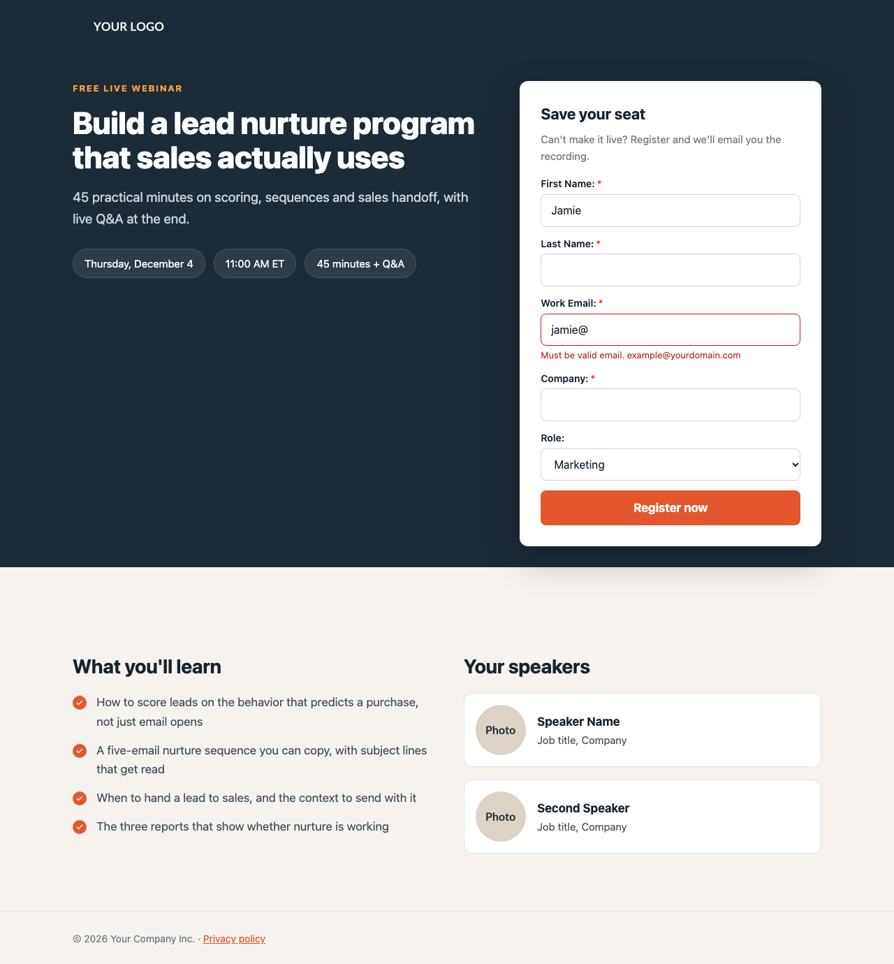
  <div class="mktoText form-heading" id="formHeading" mktoName="Form heading">Save your seat</div>
  <div class="mktoText form-note" id="formNote" mktoName="Form note">Can't make it live? Register and we'll email you the recording.</div>
  <div class="mktoForm" id="registrationForm" mktoName="Registration form"></div>
</div>
The heading and note sit outside the form, in the template, so they’re styled consistently no matter which form is chosen.
Step 3: Variables
Guided templates support the same variables as email templates. They appear in the editor’s right-hand panel, and you use them as ${id}, including inside the <style> block. This template uses them for colors and to show or hide a whole section:
<meta class="mktoColor" id="accentColor" mktoName="Accent color" default="#e4572e">
<meta class="mktoColor" id="accentDark" mktoName="Accent color (hover)" default="#c9461f">
<meta class="mktoColor" id="heroColor" mktoName="Hero background" default="#1d2b36">
<meta class="mktoBoolean" id="showSpeakers" mktoName="Show speakers section"
      default="true" true_value="block" false_value="none">

<style>
:root{--accent:${accentColor};--accent-dark:${accentDark};--dark:${heroColor}}
.speakers{display:${showSpeakers}}
</style>
Feeding variables into CSS custom properties means each one is set once and used everywhere: buttons, links, focus rings and check marks all follow the accent color. The Boolean outputs block or none, so unticking “Show speakers section” hides it on that page.
Step 4: Tame Marketo Forms 2.0
This is the hard part. Marketo forms arrive with their own layout: fixed widths set inline on the form, labels and fields, floats, offset and gutter spacers, and a theme stylesheet. The result is a narrow form with labels beside the fields that ignores your design. Two things fix it.
First, in the form editor, choose the Simple or Plain theme. They carry the least styling to undo.
Second, override the layout with CSS. Because Marketo sets widths inline, the overrides need !important. Scope every rule to your form container so it can’t affect anything else:
/* Full width, no floats, no spacer columns */
.form-card .mktoForm{width:100% !important;padding:0 !important;font-family:inherit !important;font-size:16px !important}
.form-card .mktoForm .mktoFormRow,.form-card .mktoForm .mktoFormCol,.form-card .mktoForm .mktoFieldWrap{width:100% !important;float:none !important;margin:0 !important;min-height:0 !important}
.form-card .mktoForm .mktoFormCol{margin-bottom:14px !important}
.form-card .mktoForm .mktoOffset,.form-card .mktoForm .mktoGutter{display:none !important}

/* Labels above fields; the required asterisk after the label, only on required fields */
.form-card .mktoForm .mktoLabel{display:flex !important;flex-direction:row-reverse;justify-content:flex-end;gap:3px;width:auto !important;float:none !important;padding:0 0 5px !important;font-size:14px !important;font-weight:600 !important}
.form-card .mktoForm .mktoAsterix{display:none !important;float:none !important;padding:0 !important;color:var(--accent) !important}
.form-card .mktoForm .mktoRequiredField .mktoAsterix{display:inline !important}

/* Fields */
.form-card .mktoForm input[type=text],.form-card .mktoForm input[type=email],.form-card .mktoForm input[type=tel],
.form-card .mktoForm select.mktoField,.form-card .mktoForm textarea.mktoField{width:100% !important;height:auto !important;padding:12px 14px !important;font-size:16px !important;border:1px solid #cdd4db !important;border-radius:8px !important;box-shadow:none !important}

/* Button */
.form-card .mktoForm .mktoButtonWrap{display:block !important;margin-left:0 !important}
.form-card .mktoForm .mktoButtonWrap .mktoButton{width:100% !important;padding:15px 20px !important;font-weight:700 !important;color:#fff !important;background:var(--accent) !important;background-image:none !important;border:0 !important;border-radius:8px !important}

/* Errors: a line under the field instead of a floating tooltip */
.form-card .mktoForm .mktoError{position:static !important}
.form-card .mktoForm .mktoErrorArrowWrap{display:none !important}
.form-card .mktoForm .mktoErrorMsg{margin:4px 0 0 !important;padding:0 !important;font-size:13px !important;color:#b42318 !important;background:none !important;border:0 !important;box-shadow:none !important;text-shadow:none !important}
.form-card .mktoForm .mktoField.mktoInvalid{border-color:#b42318 !important}
A few of these deserve a word:
- The asterisk. Marketo puts the asterisk before the label text, in every label, and hides it with CSS on optional fields. The rules above hide it everywhere, show it only on required fields, and move it after the label with
row-reverse. - The error message. Marketo’s default is a tooltip that floats over the next field with an arrow. As an inline line under the field, it’s easier to read and doesn’t cover anything.
- Specificity.
.mktoField.mktoInvaliduses two classes so the red border beats the normal border rule. With one class, the invalid state silently loses. - 16-pixel inputs, so iPhones don’t zoom in when a field is tapped.
Step 5: Responsive layout
The template uses CSS grid: copy on the left, the form card on the right overlapping the hero. Below 900 pixels, it becomes one column with the form directly under the headline:

Marketo forms also have their own mobile styles, which switch on for narrow screens. The overrides above keep the layout consistent, because they already make every field full width.
Step 6: Create, approve and use it
- Upload images in Design Studio → Images and Files.
- Go to Design Studio → Landing Page Templates, create a new template, choose Guided, and paste the HTML into the template editor. Save.
- Use the template’s preview to check the layout, then approve it.
- Create a landing page from it, inside the program it belongs to. Pick the form for the form element, edit the text and images, and set the variables.
- Set the page’s title and description in its settings, for search engines and social sharing.
- Submit the form empty to check the error styling, then for real to check the follow-up page and the program’s smart campaigns.
Common problems
| Problem | Cause and fix |
|---|---|
| The form is narrow with labels beside the fields | The CSS isn’t scoped correctly, or is missing !important. Check the selectors start with your form container’s class. |
| An asterisk shows on optional fields | The rule hiding .mktoAsterix by default is missing. |
| Errors float over the next field | The .mktoError position override is missing. |
${accentColor} appears in the page | The variable’s meta tag is missing, or the id doesn’t match exactly. |
| Editors can’t change an element | It’s missing the Marketo class, the unique id or the mktoName. |
Want the finished templates? Get them, plus a gated content download page, in 2 Free Marketo Landing Page Templates. Using Pardot instead? See How to Build a Pardot Landing Page Layout Template.

Author of four Opencart book.
The recent are Opencart 4 developer book and Opencart 4 user manual