The European Accessibility Act for Online Stores: What It Requires, Who Is Exempt, and the WCAG 2.2 Fixes for an OpenCart Theme
The European Accessibility Act applies to online shops selling to EU consumers. Who must comply, the micro-business exemption, and 12 WCAG 2.2 fixes.
 Rupak NepaliPublished Nov 13, 2026
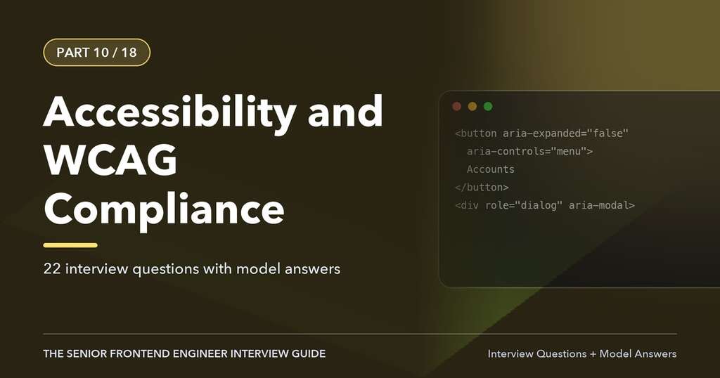
Since 28 June 2025, online shops that sell to consumers in the European Union have to be accessible to people with disabilities. That’s the European Accessibility Act (EAA), and unlike earlier EU accessibility rules, which covered public-sector websites, it applies to private businesses, including stores based outside the EU.
We covered why accessibility matters in Accessibility (ADA/WCAG) for Ecommerce Stores. This post is the practical follow-up: what the EAA actually requires, who doesn’t have to comply, and the specific fixes most OpenCart themes need, with a way to test each one.
This isn’t legal advice. Each EU country wrote the EAA into its own law, with its own enforcement body and penalties. Use this to understand the work; ask a lawyer about your obligations.
What the EAA covers
The EAA (Directive (EU) 2019/882) lists products and services that must be accessible. One of the services is e-commerce: any website or app that sells products or services to consumers at a distance. In practice, if your store:
- sells to consumers (not only to businesses),
- in any EU country,
it’s covered, whether you’re in Berlin, London, Kathmandu or Texas. B2B-only stores, where the buyer is always a business, fall outside the e-commerce definition.
The microenterprise exemption
Service providers that are microenterprises are exempt from the service requirements: fewer than 10 employees and annual turnover or balance sheet total of no more than €2 million. Many small OpenCart stores fall under this. Two cautions:
- The exemption covers the EAA, not other laws. In the US, the ADA has no size exemption, and lawsuits against small online stores over inaccessible websites are common.
- Being accessible is still good business. Around one in four adults in the EU has some form of disability, and the same fixes help older customers, people on small phone screens and people in bright sunlight.
What “accessible” means in practice
The directive describes requirements in general terms (“perceivable, operable, understandable and robust”). The detailed, testable version is the European standard EN 301 549, which for websites points to the Web Content Accessibility Guidelines (WCAG) level AA. The current EN version refers to WCAG 2.1; WCAG 2.2, published in 2023, adds nine criteria and is what an updated standard is expected to use. Target WCAG 2.2 AA and you cover both.
Other obligations
- An accessibility statement. You must explain how the service meets the requirements, usually on a page linked from your footer, in your terms or both. Include: the standard you follow (WCAG 2.2 AA), known issues and workarounds, the date of your last review, a contact for accessibility problems, and the national enforcement body.
- Keep it up to date. Every theme change and new extension can break things. Accessibility is part of your release checklist, not a one-off project.
- Enforcement is by national market-surveillance authorities. Penalties are set by each country; Germany’s implementing law, for example, allows fines up to €100,000, and authorities can order a service to be stopped.
Accessibility overlays won’t make you compliant
You’ll see widgets that promise compliance with one line of JavaScript: a floating person icon with font-size buttons and “AI-powered” fixes. They don’t fix the underlying HTML that screen readers and keyboards use, they can interfere with the assistive technology disabled customers already have, and they’re no defence. In 2025 the US Federal Trade Commission ordered accessiBe to pay $1 million for claiming its widget could make any website WCAG compliant. Spend the money on fixing the theme.
WCAG in four questions
You don’t need to read all 86 success criteria to start. For a store, almost every failure answers “no” to one of these:
- Can you shop with only a keyboard? Tab, Shift+Tab, Enter, Space and the arrow keys, all the way from the home page to the order confirmation, always able to see where you are.
- Does every image, icon and control have a text name a screen reader can announce?
- Can everyone read it? Text contrast, text that can be enlarged to 200%, and layouts that still work at 320 px wide.
- When something goes wrong, are you told what and how to fix it? Form errors, out-of-stock messages, cart updates.
Twelve fixes for an OpenCart 4 theme
The default theme in OpenCart 4 (Bootstrap 5) is a reasonable base, but it and most third-party themes have the issues below. Make the changes in your theme’s templates (a theme extension or an OCMOD), not in core files, so updates don’t undo them.
1. Product images need real alt text
OpenCart uses the product name as the alt of every product image. On a product page with five photos, a screen reader hears “Linen Shirt” five times. Write alt text that says what each image shows (“White linen shirt, back view with box pleat”), and use an empty alt="" for purely decorative images. Our AI alt text extension drafts these for every image and language for you to review.
2. Icon-only buttons need names
The header shows icons for account, wishlist, cart and checkout, and hides the text on small screens with d-none d-md-inline. On a phone, those are links with no name. The product cards’ add-to-cart, wishlist and compare buttons rely on a title tooltip. Replace the hiding class with Bootstrap’s visually-hidden on small screens, or add an aria-label:
<a href="{{ wishlist }}" aria-label="{{ text_wishlist }}">
  <i class="fa-solid fa-heart" aria-hidden="true"></i>
  <span class="d-none d-md-inline">{{ text_wishlist }}</span>
</a>
3. The search field needs a label
The header search box has a placeholder but no label. Placeholders disappear when you type and aren’t a reliable name. Add aria-label="{{ text_search }}" to the input and an aria-label to the search button.
4. Add a “Skip to content” link
Keyboard users otherwise tab through the whole header and menu on every page. Add as the first element in header.twig:
<a class="visually-hidden-focusable" href="#content">Skip to main content</a>OpenCart’s page templates already use id="content" on the main column.
5. Keep the focus outline visible
Many themes remove the outline with outline: none because it “looks untidy”. Without it, keyboard users can’t see where they are (WCAG 2.4.7). Search your theme’s CSS for outline: 0 and outline: none and replace them with a visible :focus-visible style. WCAG 2.2 also requires that a sticky header or cookie banner doesn’t completely cover the focused element (2.4.11); add scroll-padding-top equal to your sticky header’s height.
6. Menus must open without a mouse
Bootstrap’s dropdowns work with the keyboard. Mega menus in third-party themes that open only on hover don’t. Test: tab to a top-level category and press Enter. If nothing opens and you can’t reach the subcategories, the menu fails.
7. Slideshows need a pause button
The home page slideshow moves on its own. Anything that moves automatically for more than five seconds needs a way to pause it (2.2.2). Add a pause button, or turn off autoplay, which also tends to improve conversion.
8. Colour contrast
Normal text needs a contrast ratio of at least 4.5:1 with its background, large text and icons 3:1. Common failures: light grey “Ex Tax” prices, placeholder text, white text on brand-coloured buttons, sale badges. Check with the browser’s developer tools (the colour picker shows the ratio) and change the colour variables in your theme’s CSS.
9. Form errors must be announced and linked
OpenCart 4 writes errors under each field with JavaScript after an AJAX submit. Sighted users see them; a screen reader hears nothing. Two changes in your theme’s JavaScript:
- When a field has an error, set
aria-invalid="true"on it andaria-describedbypointing to its error element. - Give the alert container a live region so success and warning messages are read out:
<div id="alert" class="toast-container ..." aria-live="polite">.
Also check the add-to-cart confirmation, which appears as a toast: with the live region, “Success: You have added iPhone to your shopping cart!” is read out instead of happening silently.
10. Every input needs a visible label
Check the checkout, account and review forms in your theme. Placeholders instead of labels, radio buttons without labels (the review star rating is a common one) and custom fields without names all fail. Each <input> needs a <label for="..."> or, for groups of radios, a <fieldset> with a <legend>.
11. Targets at least 24 × 24 pixels
WCAG 2.2 adds a minimum target size (2.5.8): buttons and links need at least 24 × 24 CSS pixels, or enough space around them. Check quantity plus/minus buttons, pagination links, the close button on the cart toast, and small icons in product cards.
12. No puzzle captchas
WCAG 2.2 also adds “accessible authentication” (3.3.8): logging in or registering mustn’t depend on a cognitive test such as typing distorted letters or picking images, unless there’s an alternative. OpenCart’s basic image captcha fails this. Our free Cloudflare Turnstile extension replaces it with a check most visitors never see. And don’t block pasting into password fields, so password managers work.
How to test
Automated tools find around a third of the problems. Use them first, then test by hand.
- Automated scan of your key templates: home, category, product, search results, cart, checkout, login, register and contact. Use axe DevTools or WAVE (free browser extensions) or Lighthouse’s accessibility audit in Chrome. Fix everything they report.
- Keyboard test. Unplug the mouse. Find a product through the menu, choose an option, add it to the cart, and check out as a guest. Note every place you get stuck or lose track of the focus.
- Zoom test. Zoom the browser to 200% and then to 400% (which simulates a 320 px wide screen). Nothing should be cut off or need horizontal scrolling.
- Screen reader test. VoiceOver on Mac and iPhone (built in) or NVDA on Windows (free). Listen to a product page and the checkout. Do the images, buttons and errors make sense without seeing the screen?
- Extensions. Repeat the checks on anything an extension adds: the payment form, the cookie banner, the live chat, the reviews widget. The payment provider’s hosted fields are usually fine; third-party popups often aren’t.
Write the results into your accessibility statement and a task list, fix the checkout first (it’s where a barrier costs the most), and re-test after every theme update. If you use Git and a staging site, add an automated axe check to your pipeline so new problems are caught before they go live.
A starter accessibility statement
We want everyone to be able to shop at [Store name]. This website aims to conform to the Web Content Accessibility Guidelines (WCAG) 2.2 at level AA. We last reviewed it on [date]. Known issues: [list, with workarounds, such as “the size guide is an image; the same information is in the product description”]. If you have trouble using any part of the site, contact us at [email or phone] and we will help you complete your order and fix the problem. If you are not satisfied with our response, you can contact [national enforcement body].
Keep it honest: a statement that claims full conformance while the checkout can’t be used with a keyboard is worse than one that lists known issues and how to get help.

Author of four Opencart book.
The recent are Opencart 4 developer book and Opencart 4 user manual