Did you know that 88% of users will never use an app or site again after one bad experience? From this, you can see how vital UI design is. UI design goes far beyond aesthetics and has a decisive impact on user experience. In the guide below, we’ll tell you everything you need to know when designing user interfaces, from what UI is, to key elements, and the latest UI trends for 2022 and beyond.
What is UI design?
UI design, short for User Interface Design, refers to the process of creating the graphic layout of a digital product to support the final look and feel of the application. It includes images, animations, sliders, text fields, buttons, and various other elements that users interact with. Good UI design services lead to a friendly user experience, which is why UI design should be part of the software development process. Now let’s take a look at the elements you can use when designing your interface.
UI elements that designers should know
There are various UI elements in user interface design, which can be grouped into three categories:
Input element
Input elements are the most popular category. In the input element, the user provides various required information, such as age and reason for purchase. Input can be in a variety of formats, including text, graphics, and audio, but input elements can take the following formats:
- dropdown
- combo box
- button
- Toggle
- text/password field
- date picker
- Checkbox
- Radio button
- Confirmation dialog
Output element
Output elements are the result of actions you take on input elements. It displays alerts, warnings, completions, errors, etc., and is never neutral. For example, if you upload an image in an unsupported format, you’ll see an “Unsupported Image” message, letting you know right away that you’ll need to submit an image in a different format.
Helper element
The third category is a general term for all elements that cannot be classified into the output or input categories. As the name suggests, it helps users understand what the site is about and how to use the interface. Helper elements are further divided into three subcategories:
Navigation: This helps you navigate the interface. Examples include menus, breadcrumbs, links lists, etc.
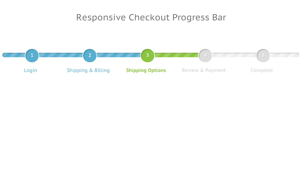
Information: Tells the user what step they are currently in or what process the website is currently performing. Examples include progress bars, icons, toolbars, etc.

Container/Group: A container that holds various UI components together. These elements often come in the form of popups, sidebars, and widgets. For example, a newsletter sign-up box like the one pictured below is a good example.

The importance of understanding the differences between UI design elements
As you can see from the three groups above, each element (output, input, and helper) has a different purpose, but UI designers must also distinguish between elements within the same group. Let me give you an example, you are trying to add a filter to an online supermarket page. You want to display only “vegan” products in search results. From a UI perspective, you’ll find several input elements.
Radio button list: Tap the correct option
List: Find the matching element and click “Vegan”
Dropdown: Scroll and tap the relevant product tag (selections are typically listed alphabetically)
Checkbox: Select not only “vegan” but also other elements such as “sugar-free” and “fair trade”
To see which elements to choose in terms of UI, you have to understand the user’s purpose and make it as simple and useful as possible to fulfill it! Speaking of simplifying user intent and interaction, this brings me to the next topic.
Best principles of UI design
What is UI design? To make life easier for users. That is the main principle that leads to the success of UI design. By putting users at the center of your ongoing UI UX development company process, you’ll better engage and retain them. This means reading your users’ minds and using data to understand their behavior. The result is a more sophisticated product that meets user needs and expectations.
And there are high expectations for it. Users are spending more and more time online and are becoming more demanding than ever before. Even if you don’t realize it, or even if you don’t call it “UI design,” you know what kind of interface is good.
After all, what happens when users struggle to navigate an app or site?
I’ll stop using it. I’ll uninstall it. So applying the right principles to simplify the user journey is critical for your business. To get started, please do the following:
1. Minimize actions and steps per screen
Users want to get where they want to go with as few clicks and taps as possible. Especially when designing user interfaces for devices with small screen sizes, space is limited and navigation techniques need to be big, thick, and thumb-friendly.

Keep your design focused both aesthetically and intentionally. It should be clear what the page or screen is, what the user needs to know, and what they need to do. For example, think of Amazon’s checkout page. Focused on product and price, auto-populated with details and shipping options, all you have to do is hit ‘buy’. Time is precious. With so many companies trying to capture the attention of their users, they can’t afford to risk “losing” to their competitors by not streamlining their tasks and actions.
2. Reducing cognitive load
Remember the Million Dollar Homepage? This is an order-of-magnitude example of cognitive overload. The bright colors and barely legible clusters of letters are eye-catching. You might be able to spot a business, like a casino or a small retail store, but before that, you’ll see another flashy pixel ad and forget everything that came before that. Cognitive load is the amount of information occupied in the brain. With that in mind, when designing an interface, your goal is to remove the clutter that users don’t need and make it easy for them to get the information they need back and forth. A common example is to toggle the color of links that the user has already clicked. You can see where you went at a glance without having to remember which page you visited. Her great UI design means users don’t have to think. It’s intuitive, and tasks are completed without you having to worry about your unsung design skills.
3. Make sure the dialog ends
Think about the last time you purchased something online. There was a three-part story there. The first part is to look for products. Part 2: Choose your product and proceed to checkout. The third part, receive your order confirmation. feel well. “If you do this, it will happen” is the simplest rule in the world, so it enters our brains. Throw this ball against a wall and it bounces back, R2D2 has the blueprint so Luke can destroy the Death Star, clicking “Buy” will notify you that the item is in your basket, and so on. Add “three parts” to user actions and feedback such as “added” notifications at each step.
4. Provide clear and easy-to-understand next steps
Have you ever scrolled through a web page and found yourself in a barren space like Arrakis? You’ll have to suddenly stop what you’re doing and have no choice but to scroll up, click back, or close the tab.
Please be very careful to prevent this from happening on your app or site. You’ve got the user where you want to go, what next?
At the core of UI design is guiding the user through the process. Subtly (or explicitly) tell them where to go and what to do next. Think about the location and function of your call-to-action ( CTA ) button. Use data to focus on user intent and placement to maximize engagement. For more information, check out our Guide: Basic Principles of User Interface Design.


