

Today, I took HubSpot CMS certified developer exam because it was free, and luckily able to become a Certified Hubspot CMS Developer. With knowledge of HTML, and CSS and going through the Hubspot courses, and making some themes and email templates provided an overall idea to pass the HubSpot CMS developer.

How to make three columns module in Hubspot?
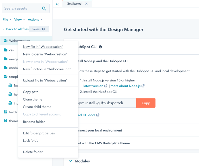
We are showing how to make three columns module in HubSpot with Hubl, HTML, and CSS. Login to the HubSpot app >> Click Marketing menu >> Files and templates >> Design Tools and right-click the theme where you need the three columns module >> Click New file.
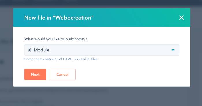
Then, select the Module and click Next.
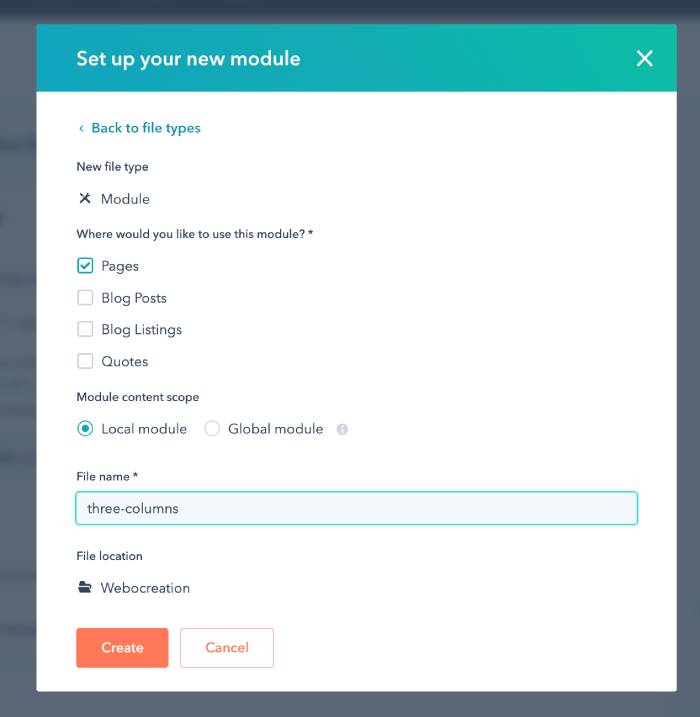
Enter the detail of the new module, check the checkbox where you want this module, here we want for Pages so only Pages is checked and module content scope is chosen Local module. Enter the file name and click Create button.
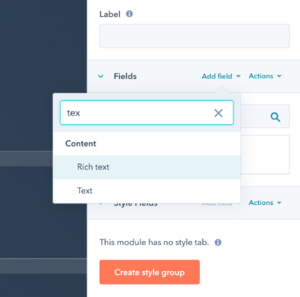
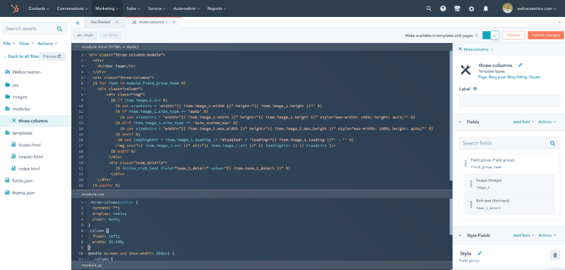
Once you created the modules, you will see the module.html, module.css, module.js file section and in the right section you can add the fields. Add two fields, one for image and another for text.
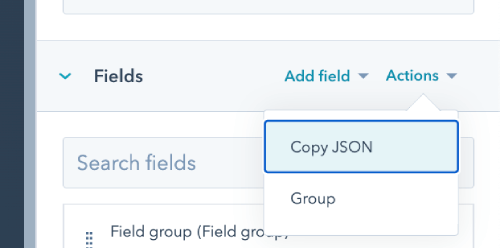
Once you created two fields, now you have to group them. Click on the Actions dropdown and select the Group.
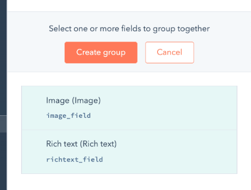
Once you selected the Group, you select all the fields and click the “Create group” button, to make it a group and name it.
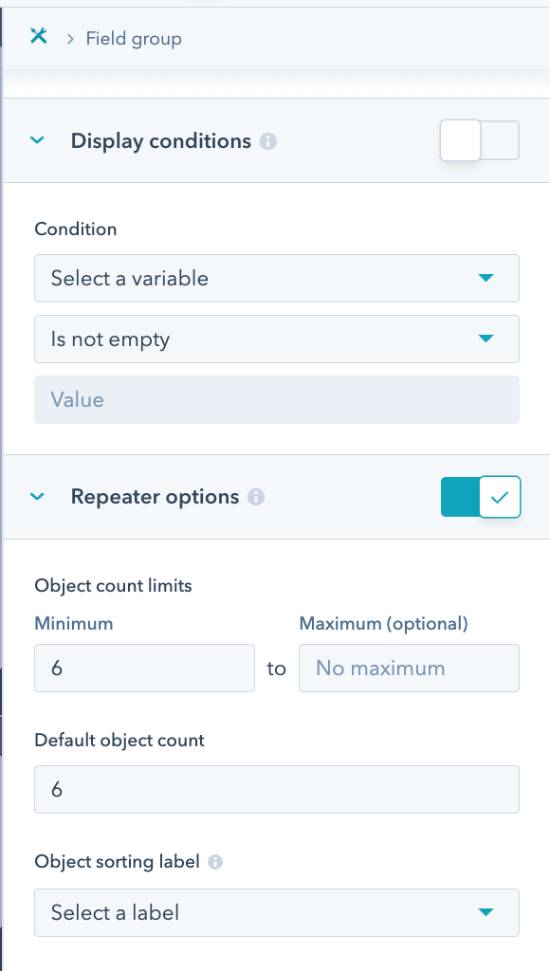
Once, you create the group, make the group fields repeatable by toggling like below and enter the minimum count, maximum count and default value.
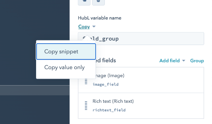
After that copy the code snippet.
Now you can modify that code to make it three columns, so for us as per the fields name below is the code that we made and added on the module.html
<div class="three-columns-module">
  <div>
    <h2>Our Team</h2>
  </div>
  <div class="three-columns">
  {% for item in module.field_group_team %}
    <div class="column">
        <div class="img">
          {% if item.image_1.src %}
            {% set sizeAttrs = 'width="{{ item.image_1.width }}" height="{{ item.image_1.height }}"' %}
            {% if item.image_1.size_type == 'auto' %}
              {% set sizeAttrs = 'width="{{ item.image_1.width }}" height="{{ item.image_1.height }}" style="max-width: 100%; height: auto;"' %}
            {% elif item.image_1.size_type == 'auto_custom_max' %}
              {% set sizeAttrs = 'width="{{ item.image_1.max_width }}" height="{{ item.image_1.max_height }}" style="max-width: 100%; height: auto;"' %}
            {% endif %}
             {% set loadingAttr = item.image_1.loading != 'disabled' ? 'loading="{{ item.image_1.loading }}"' : '' %}
            <img src="{{ item.image_1.src }}" alt="{{ item.image_1.alt }}" {{ loadingAttr }} {{ sizeAttrs }}>
          {% endif %}
         </div>
         <div class="team_details">
            {% inline_rich_text field="team_1_detail" value="{{ item.team_1_detail }}" %}
          </div>
    </div>
  {% endfor %}
  </div>
</div>
Following are the CSS that we add on the module.css
.three-columns:after {
  content: "";
  display: table;
  clear: both;
}
.column {
  float: left;
  width: 33.33%;
}
@media screen and (max-width: 900px) {
  .column {
    width: 50%;
  }
}
@media screen and (max-width: 600px) {
  .column {
    width: 100%;
  }
}
Here is how it looks:
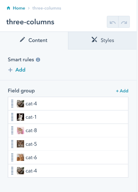
After that we publish the module and it is ready to use. Now, create a landing page and click the three-columns module section and you will see objects like below which you can change and edit as per the needs.
In this way you can create three columns module in hubspot you can solve part of the HubSpot CMS for Developers Practicum for making the module
- Team module
- Must use repeating groups of fields to allow editors to add and subtract team members
- Must be at least 3 columns on large screens with at least one media query to change the layout to 2 columns on screens below 900 pixels
Please let us know if you have any questions or suggestions, please subscribe to our YouTube Channel and read more about Salesforce, Marketo, Pardot and Hubspot. You can also find us on Twitter and Facebook.