

Today we are writing about the 5 best practices for UI designers, explaining the research, patterns, consistency, behavior, content, etc. that we need to take into consideration while designing for mobile.
What exactly is design consistency?
Consistency in design means connecting UI elements with identifiable and predictable actions. This is the key to a great product experience and is important for UX designers. To put it simply, you can think of it as a convention (“If you see a light gray button in a popup, expect it to cancel and close the popup”) to make it easier for users to interact with the product.
Once a user becomes a regular user, they begin to trust the product even more, which is the result of consistent design. Here are five best practices we use in our daily design to provide a consistent UI for our users.
1. Research on UI/UX design focusing on users
Nothing is more important than quality research for a consistent experience.
Don’t underestimate this or rush into it. Time and budget are always necessary considerations in product design. If either is missing, the product will not be shipped. While these are important in the process, it is important not to lose sight of the people who will use the product. In the early stages of product planning, be sure to conduct research with the user in mind.
Define user goals
Put yourself in the shoes of a new user. What do they want to achieve? How will the application help them? List your goals and refer to them throughout the UI/UX design services process.
For example, let’s say you’re building a travel app. This travel app allows users to select the duration of their vacation and find great flight and hotel deals within their budget. But this isn’t your standard travel site. It connects to your Facebook account and does its magic by planning the top 5 vacations based on the content you’ve shared. All users have to do is select the vacation plan they like the most and the rest is complete.
Here are some of the user’s goals:
- View vacation options within a specified period
- Compare vacation options
- Vacation selection based on user interests
- Stick to your vacation budget
Now that you know the breakdown of your goals, let’s design it to meet your users’ expectations.
Familiarize yourself with common UI patterns
Don’t reinvent the wheel when it comes to established UI patterns. Repeating patterns solve common UX and UI design problems.
Of course, UX designers shouldn’t “copy” all the layouts of similar applications. Patterns should be filtered and modified depending on the user’s goals.
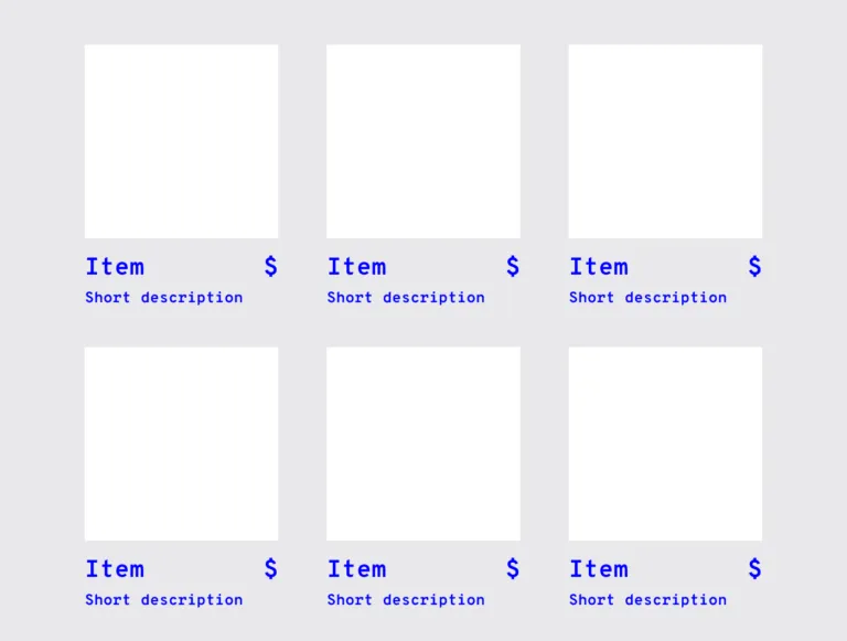
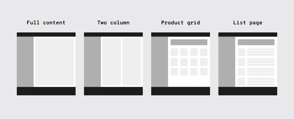
A typical pattern in e-commerce is the product grid. This pattern allows users to easily view product information.
It’s fair to say that patterns are evolving and users are aware of standard positions for elements. Many users will agree that when you want to search, it’s common to place the search bar at the top center or to the right.
2. Establish design patterns for product UI/UX design consistency
One of the keys to a successful and consistent UI is for users to perform tasks with minimal action. If a task that requires four steps can easily be completed in two, the UI should always change to accommodate short task flows. UI patterns can help with this. After all, this efficiency is why it became a pattern in the first place.
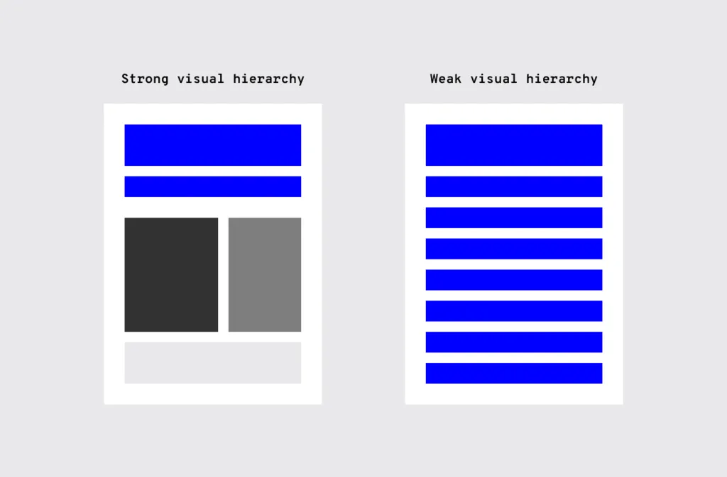
Design hierarchy
Along with design patterns, having a design hierarchy established is great for UI consistency. Users instinctively pay attention to the order and priority of the elements they interact with, whether they realize it or not.
When it comes to visuals and the human eye, certain factors are prioritized over others (large size, bright colors, etc.) and how “visible” they are. Think of screen visuals as the first thing people see, the second thing they see, and the third thing they see. This allows UX designers to not only help users find primary features faster but also present secondary and tertiary features with appropriate attention.
UI and UX design elements
An application’s UI has many design elements, each of which constitutes a building block that forms a UI pattern. Having an organized inventory and checking that elements are used properly helps maintain a consistent experience.
Branding elements
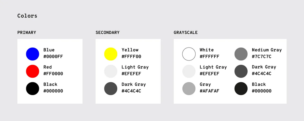
Create consistency across your brand. Typography, logos, correct image styles, brand color schemes, etc. should be reflected in your application, just like any other brand property.
Is the correct logo being used? Are the branding colors unified? Does the typeface match the others? Maintaining brand consistency ensures that new projects feel like part of the brand family, rather than a black sheep. The style guide has all the information you need.
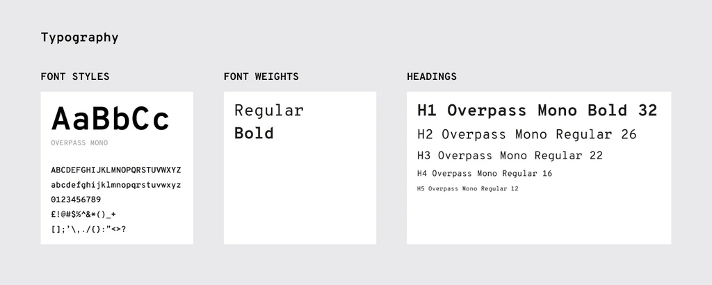
Typography
The elements that have the most visual impact, like typography, should always be ‘on-brand’.
This visual element is especially important not only for the hierarchy but also for the overall UX. By changing text size, font, and placement, you can improve scannability, legibility, legibility, and even navigation.
Component
When doing user research, you need to be familiar with UI patterns and their components. Knowing how each component behaves in and out of patterns allows UI/UX development companies to properly prioritize all elements on the screen and ensure they don’t miss anything.
“Components” are the various elements that make up a pattern, such as
- button
- card
- form
- list
- panel
- progress bar
For example, let’s say you’re considering adding pagination so users don’t have to scroll through long lists.
As you look at the wireframe, you notice that one list has pagination for 20 or more items, while another part of the application only has pagination for 40 or more items. Which is correct? This example shows that clearly determining guidelines is the backbone of consistency in UI/UX design.
Template
If you’re having trouble standardizing your site or app, try using templates.
Templates can be used in most applications, allowing the layout and elements to look the same, and streamlining UI functionality across the product. Additionally, you can use the same UI template over and over again (even years later).
Pattern library and design system
It may not be visible to users, but it’s one of the keys to consistency. Many teams today have a pattern library or design system as a reference point to keep everyone on the same page. A pattern library or design system is a rulebook that everyone on your team can reference at any time. This is essential for maintaining consistency across the team.
Pattern libraries may not be as robust as design systems because they are specialized in design patterns. The design system has more information, including useful documentation on all UI patterns and various components. Pattern libraries are also a subsection of the design system.
3. Consistent behavior in your application
The ease of use of the application is undisputed. It helps users achieve their goals by saving time, avoiding headaches, and eliminating confusion. These are all requirements for customer satisfaction.
Consistent actions eliminate the need for user discovery, making task flow smoother for users. If a user knows how to use a feature in one section, they know how to use it in all sections (as long as it’s consistent).
When users explore new parts of an application, they essentially transfer past knowledge to a new context. Consistent behavior will become second nature, and eventually, users will be able to use your application without thinking. Additionally, users can minimize the learning curve by bringing these expectations to new features and aspects of the product that they have not yet used.
The placement of “Display” is not consistent. On most cards, it’s at the top, but on collection cards, it’s at the bottom. Such inconsistent placement can cause users to pause momentarily to look for the “Show” option, not to mention undermine their own natural habit-forming process.
So, what specific points should we consider when designing an interface? Throughout the process, ask yourself questions like:
- Do all parts of the application behave the same way?
- How do interactions work? Are they predictable and consistent?
- How much discovery is required for the user to understand this interaction?
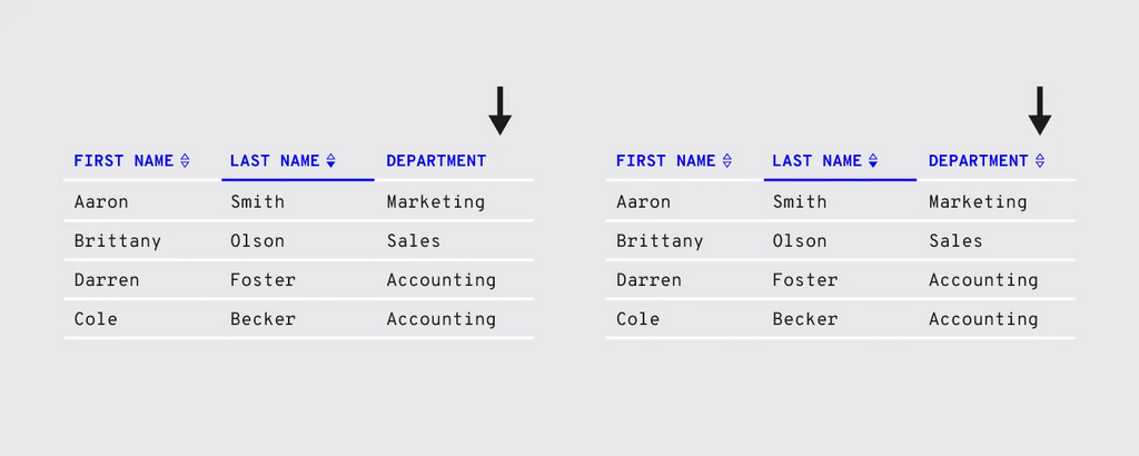
In the example on the left, the sorting is inconsistent. Not all columns have sorting options. Users may want to sort data on other columns. In the example to the right, all columns are sorted consistently.
4. Product content
Not only the visual elements are important, but also the text throughout the application.
Consistent copy throughout the application, especially consistent terminology, is also important. Using two different words to describe the same feature can make it appear as if they are two different features, causing the workflow to pause momentarily as users try to resolve the discrepancy.
Consistent copying can avoid such confusion.
Content structure
Content plays an important role in UI/UX design service elements, from something as simple as a navigation list to something as complex as product documentation. It’s not just the text, but how the copy text is expressed visually, such as body copy, list items, table content, etc. that is important.
Be especially careful when handling content in these areas.
- Navigation
- dropdown
- form field
- validation message
- Tooltip
- Chart
- image caption
- Error message
- Loading screen
- Confirmation page
- Product support documentation
Unified content branding
Sometimes you may feel that a certain part of the application doesn’t feel right. This is often due to inconsistency in the language of the content. For example, one button may say “Logout” while another button says “Sign out”.
Even inconsistencies that are not noticeable can cause a feeling of discomfort.
For fans of the Oxford comma, even “trivial” things like how to use a comma unconsciously become a concern. When these unconscious flags are raised enough times, the user’s conscious brain begins to notice.
Other writing guidelines such as title case and voice/tone also impact the user experience. The typography of the title is more experiential, but the voice and tone are a little more challenging. The problem is exacerbated when most of your content is casual in style, which clashes with your more formal “brand language.”
Default settings for appropriate users
By considering your users’ goals up front, you can set realistic defaults and reduce the burden on your users.
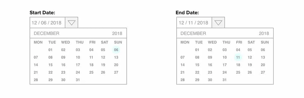
If the default settings are the most popular settings, users may not need to adjust them at all. For example, date selection screens on airline and car rental sites often default to dates in the near future based on past statistics.
You should also pay attention to your form. This is because default settings can reduce user effort.
5. Consistent communication
All user interactions, such as search results, form submission messages, and error windows, are communications. For your app to be successful, you need to speak to your users and keep them informed about what’s going on. And like everything else, the method of communication must be consistent.
Status changes and useful information
Users appreciate feedback, such as a toggle that changes color to indicate “on” or “off,” or a sound effect to confirm an action is complete.

Users should not spend time checking whether an action has taken place. This is common with form submissions, and it happens in other areas as well. In these situations, it is necessary to display a quick success (or error) message.